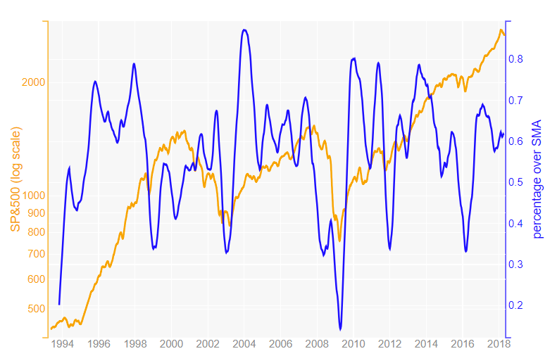
Percentage of time series over its SMA (Simple Moving Average) compared against a weighted index
Problem with weighted indexes
One problem with weighted indexes is that few components of the index can move its value when the value of few components is much bigger than the others. That could give misleading conclusions. For example, when small weighted components are not following the trend of the big ones. Some scenarios where we can see that are:
- Stocks.
- House prices.
Stocks
When a market value-weighted index like SP&500 is going up, one could think that all the stocks are going up. But sometimes few stock weight a big percentage of the index. Currently few tech companies have a high percentage on SP&500.
House prices
House market valuations often are made taking into consideration the number of sales of the zone / country (that would be like an index) and that would have the same effect as a weight index where each city would be like a stock and the country like an index. But big cities usually are more expensive than small cities and villages and they might even behave different. Currently in Spain, cities like Barcelona and Madrid prices are all times high while in some rural zones the prices haven't raised after the 2008 real state crisis. These differences can also happen in neighborhoods in big cities.
Possible solution: Percentage of time series over its SMA (Simple Moving Average) compared against a weighted index
A SMA (Simple Moving Average) is often used to reduce the fluctuation of a time series and also to see its trend easily, when current value is over or under the SMA. This can be applied to any type of time series.
So knowing the percentage of time series over its SMA might be a good way to evaluate the health of the whole market and not only the heavy weighted components if we just look the index. In fact, comparing it with the index can be quite insightful.
SP&500 and its components
As an example, I will use the S&P500 Stock Market Data, where some quotes are available in Kaggle, to calculate the percentage of stocks over their SMA of 30 weeks and compare it with SP&500.
The code can be found in my github.
The final plot is this:

